 Kexi's blog
Debugging CSS
-
A fundamental concept for CSS layout is inline vs. block elements. Inline means elements only take up the space they need, and do not affect flow. Applying
marginorpaddingto an inline element will only work in the “inline” direction (left/right) not the “block” direction (top/bottom). -
Sometimes when we include an image in our markup, a bit of mysterious space is added underneath. The problem is that images by default are considered inline elements, and setting
line-height: 0on the parent can solve it. Another way is to set the imagedisplay: block, which tells flow layout: Hey, this image isn’t a word in a sentence. It’s a block element, and block elements never have any of this inline magic space. The third way to solve this is not using flow layout, but set parentdisplay: flex. -
input,video,img,iframe,embedare replaced elements whose width and height are predefined, without CSS.iframehas the default width300pxand height150px. -
When an element has a
positionvalue ofabsolute, it becomes a block-level element by default. This means that addinginline-blockorblockas the display type won’t affect it at all. -
The
<p>element represents a paragraph. It cannot contain block-level elements including<p>itself. For example,<p><div>hello</div></p>will be parsed as<p></p><div>hello</div><p></p>in Chrome. (Invalid HTML will be fixed by the browser) -
When you apply a
floatto an element with a display type offlexorinline-flex, it won’t affect the element at all. -
Say you have two elements, the one above with
margin-bottom, and the one below withmargin-top. The greater of the two values will be used as the margin between the elements, and the other will be ignored by the browser. -
margin: autois a popular way to center an element, and it’s important to mention that auto margins (e.g.margin-right: auto) will take up the extra space and apply it to the element’s margin. -
You can’t set a percentage-based height for an element unless the height of its parent is explicitly defined. You can use
body { height: 100vh }to make thebodyelement take up the full height of the viewport. -
Children of parents with
min-heightcan’t inherit the height property. The easiest workaround is to addheight: 1px;to the parent. Alternatively you may setmin-height: inherit;to the child. -
Elements are grouped into stacking contexts. When we give an element a
z-index, that value is only compared against other elements in the same context.z-indexvalues are not global. By default, a plain HTML document will have a single stacking context that encompasses all nodes. But there are many ways to create stacking contexts, e.g., combining relative or absolute positioning withz-index; Setting position tofixedorsticky; Settingopacityto a value less than 1; Adding az-indexto a child inside adisplay: flexordisplay: gridcontainer; Usingtransform,filter,perspective. -
The
::beforepseudo-element becomes the first child of its parent, whereas::afteris added as the last child. The default display value of a pseudo-element isinline. So when you add a width, height, vertical padding or vertical margin, it won’t work unless thedisplaytype is changed. -
By default, the
colorproperty is inherited by child elements such aspandspan. Instead of setting the color property on each element, add it to thebody, and then allpandspanelements will inherit that color. However, thea,input, orbuttonelement doesn’t inheritcolorby default. You can override its color or use theinheritkeyword (to inherit those non-inheritable properties.) -
A common mistake when showing a border on hover is to add the border only on hover. If the border is 1 pixel, then the element will jump by that much when the user hovers over it. To avoid the jump, add the border to the normal state with a transparent color.
-
Unlike border,
outlineis drawn outside the element’s border and may overlap other content. Also, the outline is not a part of the element’s dimensions; the element’s total width and height is not affected by the width of the outline. You can override it with a custom one, but don’t remove that outline under any circumstances, because it will affect the accessibility of the website. -
Find element that is causing the showing of horizontal scrollbar.
let all = document.getElementsByTagName("*"), rect, docWidth = document.documentElement.offsetWidth; for (let i = 0; i < all.length; i++) { rect = all[i].getBoundingClientRect(); if (rect.right > docWidth || rect.left < 0) { console.log(all[i]); all[i].style.outline = "1px solid red"; } }getBoundingClientRectreturns aDOMRectobject which is the smallest rectangle which contains the entire element, including its padding and border-width. The left, top, right, bottom, x, y, width, and height properties describe the position and size of the overall rectangle in pixels. Properties other than width and height are relative to the top-left of the viewport. -
A long word or link can easily cause horizontal overflow (scrolling). The solution is to use
overflow-wrap: break-word. It’s worth mentioning that the property has been renamed fromword-wraptooverflow-wrap. -
Flexbox doesn’t wrap by default, thus may cause horizontal scrolling. Always make sure to add
flex-wrap: wrap. By default, flexbox stretch its child items to make them equal in height if the direction is set torow, and it makes them equal in width if the direction is set tocolumn. -
Each flex item has a
flex-basisproperty, which acts as the sizing property for that item. When the value isflex-basis: auto, the basis is the content’s size. With.item { flex-grow: 1; flex-basis: 0%; }, each child item will take up the same space as its siblings.flex: 1is equivalent toflex: 1 1 0. -
While the default
min-widthvalue is 0 (zero), for flex items it isauto. This can make block elements take up much more space than desired, resulting in overflow. The solution is to addmin-width: 0;to the flex item. -
flex-basisis more of a suggestion than a hard constraint. At a certain point, there isn’t enough space for all of the elements to sit at their assigned size, and so they have to compromise, in order to avoid an overflow. The default value forflex-growis 0. The default value forflex-shrinkis 1. -
You can add infinite borders using
box-shadowif you want to apply multiple borders on one div.box-shadowis described by X and Y offsets relative to the element, blur and spread radius, and color. You can set multiple effects separated by commas.img { margin: 40px; width: 90px; border-radius: 50%; /* box-shadow: x-offset y-offset blur spread color */ box-shadow: 0 0 0 10px #817dd1, 0 0 0 20px #5c58aa, 0 0 0 30px #3d3a84, 0 0 0 40px #211f56; } -
In order for the
postion: stickyelement to function correctly, it needs to have at least one of it’stop,right,left, orbottomplacement properties set. Also look for anyoverflowproperty set on any parents of the element. You can’t useoverflow: hidden,overflow: auto, oroverflow: scrollon the parent of aposition: stickyelement. -
If you are using
visiblefor eitheroverflow-xoroverflow-yand something other thanvisiblefor the other, thevisiblevalue is interpreted asauto. Say if one is set tovisible, and the other toautoorhidden, then thevisibleis changed toauto..wrapper { overflow-y: hidden; /* browser will add this by default, resulting in clipping both sides. */ overflow-x: auto; } -
This is where the
overflow: clipbecomes helpful. It’s supported by all major browsers. If you setoverflow-ytoclip. Theoverflow-xvalue will stay as is (visible). Now the clipping happens only on the y-axis. -
You may have noticed that when you have a dialog box with scrolling content at the top of a page that also has scrolling content, once the dialog box’s scroll boundary is reached, the underlying page will then start to scroll — this is called scroll chaining. This can be stopped using
overscroll-behavior: containon the dialog box.overscroll-behavior: nonemeans that no scroll chaining occurs to neighboring scrolling areas, and default scroll overflow behavior is prevented. -
Position
fixeddoesn’t work withtransformproperty for the ancestor element. It happens becausetransformcreates a new stacking context and containing block, causing the fixed element to be positioned relative to that ancestor instead of the viewport. -
Center one and right/left align other element: Grid layout may be the cleanest and most efficient method. There is no need for absolute positioning or flexbox with fake elements.
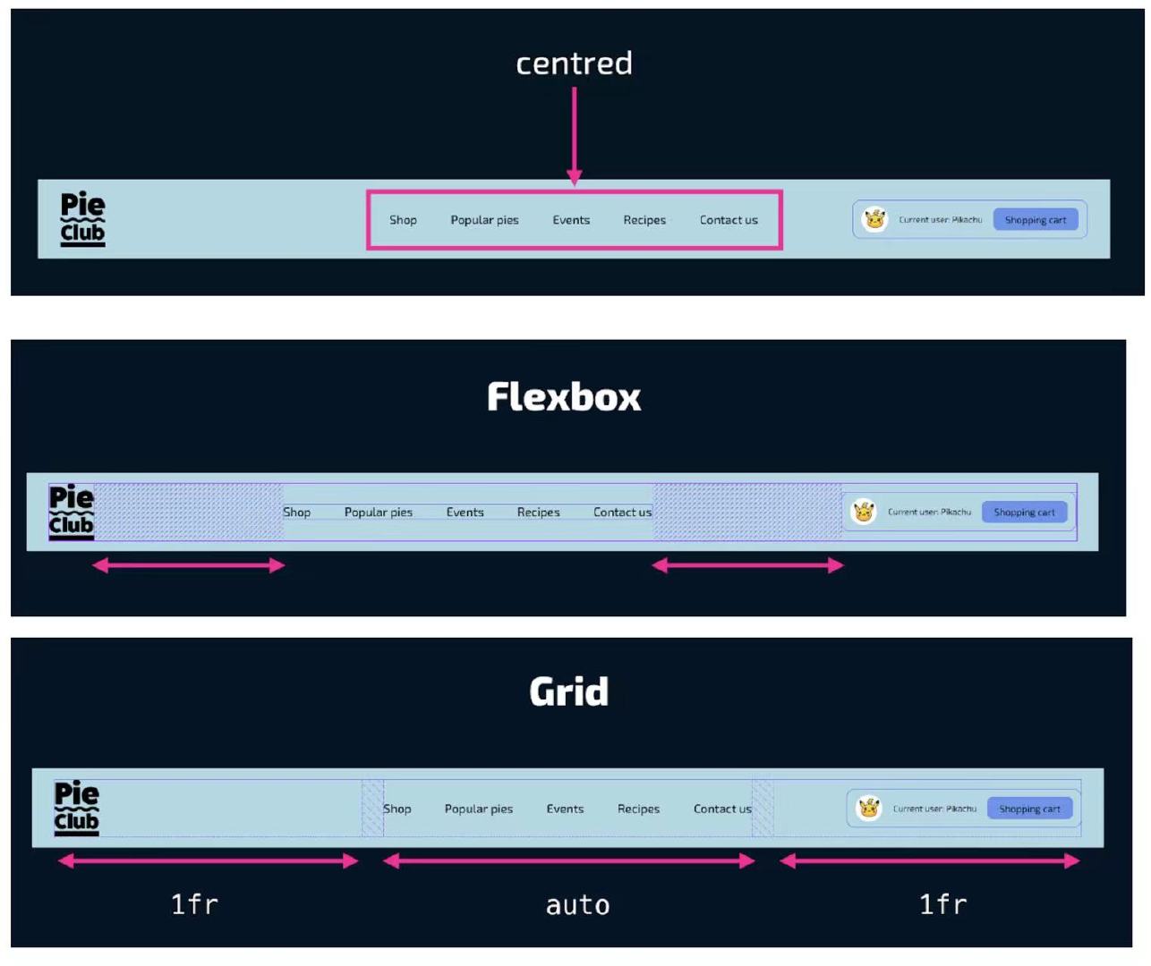
(above picture comes from @shadeed9)
header { display: grid; grid-template-columns: minmax(0, 1fr) auto minmax(0, 1fr); } .left-text, .right-text { white-space: nowrap; overflow: hidden; text-overflow: ellipsis; } -
The
grid-template-areasproperty specifies areas within the grid layout (limited to rectangular grid areas). Once the template areas are defined, we can reference them in CSS and assign each named area to its designated element by using thegrid-areaproperty..page { display: grid; grid-template-columns: 200px 1fr; /* rows are implicitly created */ grid-template-areas: "aside main" "footer footer"; gap: 1rem; } .aside { grid-area: aside; } .main { grid-area: main; } .footer { grid-area: footer; } -
We are creating a new grid when we use
subgrid, but that grid will inherit the template from the parent grid. There’s only one grid structure, but it can be shared by multiple grids. For example, if you usegrid-template-columns: subgridand the nested grid spans three column tracks of the parent, the nested grid will have three column tracks of the same size as the parent grid..grid { display: grid; grid-template-columns: repeat(4, 1fr); grid-template-rows: repeat(4, 1fr); .subgrid { grid-column: 2 / 5; grid-row: 2 / 5; display: grid; grid-template-columns: subgrid; grid-template-rows: subgrid; } } -
Have you ever wondered why padding is inconsistent above and below text elements? Each font has a different
line-heightand that comes with a different spacing above and below the text. To fix that, we can add a fake element next to the button’s TextNode, and when a pseudo-element is placed next to it, we can usevertical-align: middleto center both. This is a much better solution than setting the different top and bottom spacing values..button:before { content: ""; display: inline-block; height: 16px; vertical-align: middle; } -
A dialog is a component in a web page or app that usually contains an action or some task to perform. Dialogs have a role of
dialog, which the browser will assign automatically for you when you use the<dialog>element. You can also create dialogs with ARIA: applyrole="dialog"to an element like<div>. If it is a modal dialog, addaria-modal="true"when it shows, and remove it when it is dismissed. Dialogs can be modal (when shown withdialog.showModal()) or non modal (when shown withdialog.show()). When<dialog>s are modal, the browser will treat the content outside of the dialog as inert, and prevent keyboard focus from reaching web content outside of the dialog. If a<dialog>is not modal, the other content is not treated as inert. Browsers will close modal dialogs when users pressEscape. Non-modal dialogs don’t get this default behaviour, developers can add it where it makes sense. Check out the slides about how to build dialogs and popovers. -
CSS
unsetresets toinheritif the property is inherited and toinitialfor non-inherited properties.inheritis pretty straight-forward that inherits all defined properties from its parent element (to inherit those non-inheritable properties).revertwill set the property to the user agent stylesheet value — AKA the default browser style.initialis the nuclear option. This will reset a CSS property as if no CSS rules had been written for that value, which means it’s gonna remove the style all together.<!-- What color is the <p> tag’s text? --> <!-- The answer is red since unset “unsets” the style of the p tag, so it inherits from its parent – body. --> <p class="hello">Hello</p> <style> body { color: red; } p { color: green; } .hello { color: unset; } </style> -
Stop re-inventing the wheel and just use
<button>to create a button. If you’re worried about default button styles, useall: unset. This one line of CSS will strip all default browser styles so you can apply your own. -
Sometimes the web page looks strangely inflated on mobile landscape devices. The reason is that Mobile Safari increases the default font-size when you switch a website from portrait to landscape. The way to control this font-size inflation is with the
-webkit-text-size-adjustproperty, which you can set to a percentage which to increase the text size to at the most, toautofor default behavior or tononeto prevent zooming text in. Setting it to100%is equivalent tonone./* Prevent font size inflation */ html { -moz-text-size-adjust: none; -webkit-text-size-adjust: none; text-size-adjust: none; } -
The border radius of the outer element should be equal to the sum of the border radius of the inner element and the distance between the two elements. So if the outer element border radius is 20, and there’s a 5px space between the outer element and inner element, the inner element border radius should be 15.
-
Before Chrome 118, font sizes smaller than 10px or so were not rendered as specified, but rounded up if the language was Arabic, Farsi, Japanese, Korean, Thai, Simplified or Traditional Chinese. Developers needed workarounds to render small text, for example by using the
transformproperty. From Chrome 118, this limit is ended for all languages, making the seven languages match the rest. -
Less absolute positioning with modern CSS. For example, when we have a card that contains text over an image, we often use
position: absoluteto place the content over the image. This is no longer needed with CSS grid.grid-area: 1 / -1;(interpreted asgrid-area: 1 / -1 / auto / auto) places the element on the first row and makes it span all the way to the last column. It’s a common way to make an element stretch across an entire row or column in a grid layout./* By default, CSS grid will create rows automatically based on the content. */ .card { position: relative; display: grid; } .card__thumb, .card__content { grid-column: 1/2; /* we can also use `grid-area: 1/-1` */ grid-row: 1/2; } /* grid-area: 2 / 1 / 2 / 4; */ /* grid-row-start / grid-column-start / grid-row-end / grid-column-end*/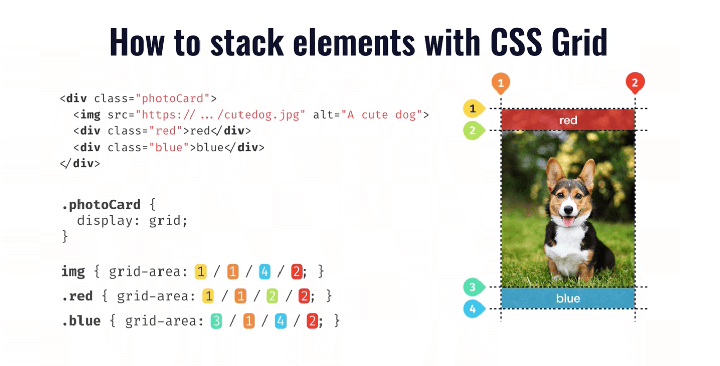
-
text-underline-offsetsets the offset distance of an underline text decoration line from its original position. All browsers support this property. Note that it is not part of thetext-decorationshorthand. -
The
white-spaceCSS property sets how white space inside an element is handled. By default, the sequences of white space are collapsed. Newline characters in the source are handled the same as other white space. Usewhite-space: pre-wrap;to preserve spaces, tabs, and new lines. -
To opt the entire page into the user’s color scheme preferences, declare
color-scheme: light dark;on the:rootelement. To style elements based on color scheme preferences, use theprefers-color-schememedia query. Alternatively, use thelight-dark()function to set colors for the different color schemes. -
The
light-dark()CSS function is a relatively new color function that allows you to specify different colors for light and dark color schemes. It provides a more direct way to handle color variations between light and dark modes. It prevents you from having to use the@mediaquery and re-declare variables.:root { color-scheme: light dark; --dark: darkslategrey; --light: beige; --fg: light-dark(var(--dark), var(--light)); --bg: light-dark(var(--light), var(--dark)); color: var(--fg); background: var(--bg); } :root:has(option[id="theme-system"]:checked) { color-scheme: light dark; } :root:has(option[id="theme-light"]:checked) { color-scheme: light; } :root:has(option[id="theme-dark"]:checked) { color-scheme: dark; } -
CSS animations are pretty sweet, but they typically require explicit sizes, you couldn’t use the intrinsic sizing keywords like
auto,min-content, orfit-content. From Chrome 129, you can declareinterpolate-size: allow-keywordson:rootto enable transitioning to and from intrinsic sizing keywords for the entire document. -
When the image is less wide than the container and we want the
<figcaption>to only be as wide as the image is.
figure {
  inline-size: fit-content;
  margin-inline: auto;
}
figcaption {
  /* The element’s inline size is not determined by its children. */
  contain: inline-size;
}